Amelia's Magazine | Bauhaus: Art as Life at the Barbican Art Gallery
Bauhaus Illustration: Less isn't always more?
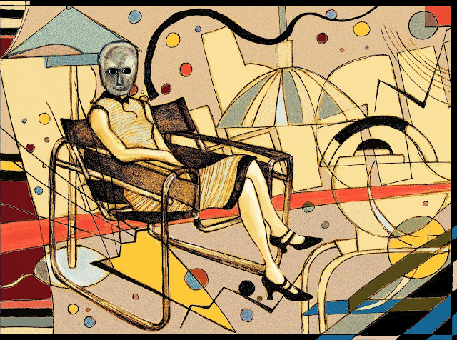
I was really excited to make a start on a Bauhaus inspired illustration for Matt Bramford's review of the Barbican Bauhaus exhibition for Amelia's Magazine. I have always been a fan of this artistic style, way of life, philosophy and there was so much rich source material to draw on. I started out thinking, now here is my chance to really curb my tendency to "overdo" things and go for something stylish, simple and minimal. I found the photograph of Lis Beyer or Ise Gropius seated in the steel-tube armchair by Marcel Breuer (pictured below) and some other bits and bobs, coffee pots, lamps, side tables, and set to work. I started out with just the figure on the chair (in the scary mask) and thought she was looking a bit lonely, then almost as a doodle sketched in the background bits, thinking I'd probably erase them digitally later, or move them around.
As usual I was drifting away from my "less is more" good intentions and falling into "over egg-ing the pudding" territory.
So at that point I scanned in my drawing and thought I'd start playing around digitally. the results can be seen here:
Thinking that the addition of colour and then subsequent removal of those background bits and adding in some shapes digitally I had found still wasn't really working, I decided to do my "sleep on it" number and come back fresh the next morning. It really was "back to the drawing board" as next day I started out with the paper again, finding a Kandinsky painting that inspired me afresh, and appealed to my tendency to go the "more is more" route, more colours, more lines, more squiggles and somehow it seemed to finally bring the whole thing together. The result can be seen below.
 |
| the addition of the Kandinsky-esque lines and shapes after sleeping on it and going back to the drawing board (literally) |


 |
| The final illustration as published |
 |
| Wassily Kandinsky
Untitled (from the portfolio for Walter Gropius on his birthday, 18th May 1924), 1924 Bauhaus-Archiv Berlin
|
 |
| Lis Beyer or Ise Gropius seated in the steel-tube armchair by Marcel Breuer by Erich Consemuller (1926, gelatin silver print,image courtesy Wulf Herzogenrath collection |
| The Bauhaus Teapot is part of the tea and coffee set designed by Marianne Brandt in 1924. |


Good to see your workflow and thought process :)
ReplyDeleteHey! thanks Wolf! :)
Deleteyes, thanks for sharing the process: love it!
ReplyDelete