Amelia's Magazine | Bat For Lashes at the Forum: Live Review
Sunday, 2 December 2012
Amelia's Magazine | Ashley Isham: London Fashion Week S/S 2013 Catwalk Review
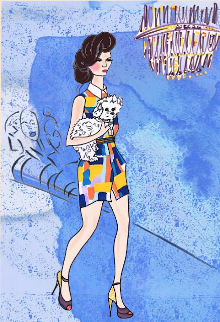
new "cartoony" style experiment and of course I got to draw a dog again woo!
Amelia's Magazine | Ashley Isham: London Fashion Week S/S 2013 Catwalk Review
Amelia's Magazine | Ashley Isham: London Fashion Week S/S 2013 Catwalk Review
Amelia's Magazine | Corrie Nielsen: London Fashion Week S/S 2013 Catwalk Review
Amelia's Magazine | Corrie Nielsen: London Fashion Week S/S 2013 Catwalk Review
I really enjoyed the chance to illustrate Corrie Neilsen again, great designer and fabulous fairytale dresses. These were like tulips, quite exquisite. Hope I managed to do them justice. This was a watercolour painting with an abstract tulip background digitally added later, and I blended the colours on the "petals" digitally too.
I really enjoyed the chance to illustrate Corrie Neilsen again, great designer and fabulous fairytale dresses. These were like tulips, quite exquisite. Hope I managed to do them justice. This was a watercolour painting with an abstract tulip background digitally added later, and I blended the colours on the "petals" digitally too.
Amelia's Magazine | Happy and Glorious: Queen Elizabeth II’s Diamond Jubilee Illustrated
I can't believe I missed sharing/blogging on this one - how remiss of me! My illustration of the Queen and her corgis back in June with some other wonderful illustrations and entertaining writing as ever from Matt Bramford.
Amelia's Magazine | Happy and Glorious: Queen Elizabeth II’s Diamond Jubilee Illustrated
Amelia's Magazine | Happy and Glorious: Queen Elizabeth II’s Diamond Jubilee Illustrated
Wednesday, 22 August 2012
Amelia's Magazine | Kotki Dwa Staycations Album Launch Interview with Alex Ostrowski
 |
| Final illustration |
I answered a callout from Abi Renshaw to illustrate her interview and article about Kotki Dwa and the National Trust "staycations" for which they had recorded a song and video centred around National Trust properties.
Abi had a very clear picture in her mind of how she wanted the illustration to look, being an illustrator herself, and she sent me 2 specific images to work from and combine into 1 illustration. Namely Sutton House National Trust property and the 3 band members in this pose with camera, binoculars and map. So I obliged!
You can find the first part of Abi Renshaw's epic interview and article here:
Amelia's Magazine | Kotki Dwa Staycations Album Launch Interview with Alex Ostrowski
Kotki Dwa — Staycations from Kotki Dwa on Vimeo.
Amelia's Magazine | London 2012: The XXX Olympic Games
I decided on illustrating the lovely Olympic Park just prior to the Olympics opening. Wow what a show it turned it out to be! I was so proud to be British - Go US! :-) (as in us, not USA) Great write up by Matt Bramford too and some great illustrations, as always.
With this illustration I started out with a pastel drawing but used my wacom tablet and pen alot to continue painting and drawing (and getting rid of the too imposing corkscrew thing) once I had scanned in the pastel and pen drawing.
 |
| work in progress, before digital painting and drawing and editing |
Amelia's Magazine | The Canine Games 2012 Illustrated
 |
| The finalised illustration |
I had great fun in the run up to the Olympics, illustrating this event, "The Canine Games" for a review for Amelia's Magazine. as there were so many wonderfully irresistible dogs I drew 3 and combined them into one mega illustration placing them on the stage of one of the events "Lady and the Tramp".
Amelia's Magazine | The Canine Games 2012 Illustrated
Amelia's Magazine | An interview with Japanese singer Cuushe about the making of Girl / You Know That I am Here / But the Dream
Amelia's Magazine | An interview with Japanese singer Cuushe about the making of Girl / You Know That I am Here / But the Dream
 |
| close up/detail of Cuushe's beautiful face |
 |
| due to my indecisiveness on what version to use, toyed with using a 4 in 1 version! |
 |
| a potential final version |
 |
| initial sketch |
 |
| work in progress |
 |
| The version I used finally for the article |
Amelia's Magazine | Frankie Rose at the Lexington: Live Review
 |
| 1st draft drawing |
 |
| added a bit of colour |
 |
| made the background warmer |
 |
| that hair took blumin' ages! New discovery - the smudge tool |
 |
| detail of final image |
 |
| Final image as seen in Richard Pearmain's fab review |
Amelia's Magazine | Frankie Rose at the Lexington: Live Review
Wednesday, 4 July 2012
Amelia's Magazine | An interview with Foreign Slippers and review of album Farewell to the Old Ghosts
Amelia's Magazine | An interview with Foreign Slippers and review of album Farewell to the Old Ghosts
Just completed an illustration of Swedish singer Foreign Slippers for Amelia's Magazine. I thought I would share my workflow from start to finish, there was was quite a bit of struggling with resizing and perspective in this one which created alot of work as I decided to undo it mostly to return more to the original proportions! (but handily had not saved the coloured in version pre twiddling). Still I got there in the end!
Just completed an illustration of Swedish singer Foreign Slippers for Amelia's Magazine. I thought I would share my workflow from start to finish, there was was quite a bit of struggling with resizing and perspective in this one which created alot of work as I decided to undo it mostly to return more to the original proportions! (but handily had not saved the coloured in version pre twiddling). Still I got there in the end!
Tuesday, 15 May 2012
Amelia's Magazine | Bauhaus: Art as Life at the Barbican Art Gallery
Amelia's Magazine | Bauhaus: Art as Life at the Barbican Art Gallery
Bauhaus Illustration: Less isn't always more?
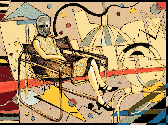
I was really excited to make a start on a Bauhaus inspired illustration for Matt Bramford's review of the Barbican Bauhaus exhibition for Amelia's Magazine. I have always been a fan of this artistic style, way of life, philosophy and there was so much rich source material to draw on. I started out thinking, now here is my chance to really curb my tendency to "overdo" things and go for something stylish, simple and minimal. I found the photograph of Lis Beyer or Ise Gropius seated in the steel-tube armchair by Marcel Breuer (pictured below) and some other bits and bobs, coffee pots, lamps, side tables, and set to work. I started out with just the figure on the chair (in the scary mask) and thought she was looking a bit lonely, then almost as a doodle sketched in the background bits, thinking I'd probably erase them digitally later, or move them around.
As usual I was drifting away from my "less is more" good intentions and falling into "over egg-ing the pudding" territory.
So at that point I scanned in my drawing and thought I'd start playing around digitally. the results can be seen here:
Thinking that the addition of colour and then subsequent removal of those background bits and adding in some shapes digitally I had found still wasn't really working, I decided to do my "sleep on it" number and come back fresh the next morning. It really was "back to the drawing board" as next day I started out with the paper again, finding a Kandinsky painting that inspired me afresh, and appealed to my tendency to go the "more is more" route, more colours, more lines, more squiggles and somehow it seemed to finally bring the whole thing together. The result can be seen below.
 |
| the addition of the Kandinsky-esque lines and shapes after sleeping on it and going back to the drawing board (literally) |


 |
| The final illustration as published |
 |
| Wassily Kandinsky
Untitled (from the portfolio for Walter Gropius on his birthday, 18th May 1924), 1924 Bauhaus-Archiv Berlin
|
 |
| Lis Beyer or Ise Gropius seated in the steel-tube armchair by Marcel Breuer by Erich Consemuller (1926, gelatin silver print,image courtesy Wulf Herzogenrath collection |
| The Bauhaus Teapot is part of the tea and coffee set designed by Marianne Brandt in 1924. |
Subscribe to:
Comments (Atom)


