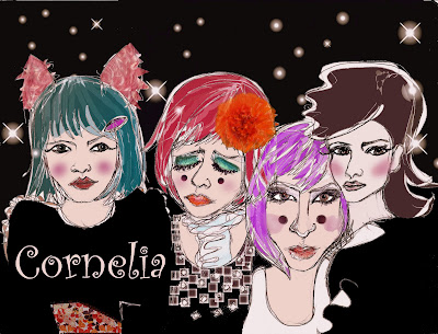
Progress of an illustration: Amelia's Magazine illustration of Cornelia.
I started out with this sketch which is based on photographs of Cornelia in different wigs and some bunny ears. I thought it would be fun to have 4 Cornelias in one illustration as she looked so different in each one.
 After scanning and cleaning up the image I added colour digitally:
I thought that the far left "Cornelia was too dominant with her dress taking up too much space visually and I also thought her arms were looking a bit odd.
So I toned down the dress by making it mostly black thereby having it blend into the background more and got rid of the weird arms:

At this point I also thought it would be fun to have real fur ears and a real flower hairbow so I added them.

I wasn't sure whether to have text so here is a version I did with "Cornelia" added.
I still wasn't happy with the dominance and pose of the far left "Cornelia and I had a fancy to try and emulate Queen's Bohemian Rhapsody video so I re-jigged things a bit thereby losing the offending arms and pose and the end result follows in the next post.
No comments:
Post a Comment