For some reason the previous pictures don't seem to be clickable on to make them bigger - probably something to do with the fact I used Picasa, sorry Apple I don't rate your computer software stuff - when I put Itunes on my computer it made the sound not work, now Picasa was good for editing the photos but . . . . hmmm I could go on! I like having an iphone but I can see why so many people hate Apple! Seems a bit like it's designed to take over your computer. Anyway here is the picture a bit bigger.
Tuesday, 30 November 2010
Larger View of Whale and Pine entry picture
For some reason the previous pictures don't seem to be clickable on to make them bigger - probably something to do with the fact I used Picasa, sorry Apple I don't rate your computer software stuff - when I put Itunes on my computer it made the sound not work, now Picasa was good for editing the photos but . . . . hmmm I could go on! I like having an iphone but I can see why so many people hate Apple! Seems a bit like it's designed to take over your computer. Anyway here is the picture a bit bigger.
Monday, 29 November 2010
Sick Birthday card!
Now this might be a bit near the knuckle but it's for someone who has had chemotherapy, (a year or two back now). But following chemotherapy first her hair fell out and she had to wear wigs etc., but when it grew back it as sometimes does, it was thicker, curler, and a different colour, pretty much an improvement by all accounts. I designed this card and manipulated an old L'Oreal Elnet hairspray ad for a birthday card. Just hope that she doesn't find it in bad taste, or more accurately (as it is pretty bad taste!) ) that if she does, she still thinks it's funny!
WhaleandPine Whale picture
I have emailed this off to Whale and Pine who are a company selling prints of "Exclusive handpicked Artwork, Prints, and Accessories created by selected artists, illustrators and designers". They have a competition running: "Open Call to all artists, designers and illustrators around the world to create an amazing and decorative piece of art that people would love to hang on their walls. Subject: A Whale in your style. It can be anything from a Narwhal to an Orca. We are looking for imaginative, stylish and fresh approach to a scene composed around our protagonist". So this my attempt. they only have about 16 or 17 artists whose work they currently sell and my work isn't really in the same style, but even if all I get is a bit of feedback, it was a good exercise in working to deadline and to a "commission" of sorts.
If they select your work, (they are selecting a few people) they put it on their website to be sold as prints and the person who's whale sells the most over the next month or so is the winner! But even if you were not the winner it's still good exposure. I doubt mine will be chosen (it's no masterpeice - and it's not in the general style of artists they have already - who are all different obviously but seem to fit the general description of very modern, minimal, clean and quirky - mine is a bit messy and smudgy and probably retro!)
If I can do another one before the extended dealine of 30th November (tomorrow!) I might just email that off too. I'll really try to be less messy and leave more white spaces left on the page!
Tuesday 30th:
Well I have managed to do a second picture today and just emailed it off to them. But I thought I'd just share the starting point and inspiration for it, and the process of coming to finsihed result. I started with a piece of wrapping paper from my birthday that I had kept, in the style of a tattoo such as Amy Winehouse's (it says they tried to make me go to rehab. . .) - I cut the design out and kept it because I liked it. That got me thinking, navy, old sea dogs, sailors, etc, they all have tattoos and because the picture was to be a whale and that means the sea, a ship etc, bit like the first picture. But this time tattoo inspired - I also flicked through a book I have of 1000 tattoos to gen up on the styles and techniques. For the whale I found a scrimshaw carving to use as inspiration. The scallop shape was a kind of nod to Maggie Hambling's Scallop on Aldeburgh beach. As I was drawing I realsied that the picture started to remind me of the Adnams beer artwork for their ads, it must have been subliminal due to the fact that Southwold where it brewed is just up the road from Aldeburgh.!
Tuesday, 16 November 2010
Studio progresses albeit slowly, and with that, my artistic identity?
I made a bit of headway (with the help of handy father-in-law) on my studio this weekend, Monday, and today. It's been slower than I would have liked as the bare materials I got were inadequate, and need alot of "bodging" and embellishing. I realise now I should have paid more for the summerhouse in the first place! If you are thinking of getting one, I do not recommend purchasing one online from Homebase for around £500. It was rubbish, did not slot together correctly and has cost almost as much again in making good. The roofing felt was rubbish and needed to be replaced, the walls did not fit, etc etc, I could go on. Here's the latest pictures. The roof felt is being weighted down with broken up paving slab bits to try and stop the joins lifting whilst the roofing felt "glue" sets. I am covered in bitumen - well I was but it took a kitchen scourer type device to remove it from me with quite a bit of hefty rubbing.
On another note, I'm really pleased the deadline for the Whale Pine competition has been extended, I think I did a good pastel and paint whale picture but I think it can be improved upon and the extended deadline gives me the time to do that. This weekend I will hopefully see the structural work on the studio finished and the fun part - internal decor, can begin! I don't want to get too distracted, however, as it is a working space, and faffing about with interior design too much might be too much of a distraction!
Friday, 5 November 2010
New Web Presences!
I have been mucking aboot with websites and things. I have a website
and I also have an online presence with none other than Charles Saatchi himself
Haven't actually been discovered by him as yet in person, but here's hoping!
Just found out today that the theme for Summer Exhibition at the Royal Academy next year is : no theme! Good oh - I decided that I would enter last year, its fiercely competitive but something to aim for - submissions to be in for consideration by end March - so not that long really :-/
Friday, 29 October 2010
Currently in negotiations with pop group. . .
. . . to be their exclusive consultant designer! That's what my contact with the band, Real PD, said I should say. It's not finalised yet but it's quite exciting, I just hope I can cope with all the creative egos if I do eventually collaborate with them!
Thursday, 28 October 2010
Blogging along nicely!
I am starting to understand what blogging is all about (sort of), why it's worth having a blog, and enjoying having one! I used to write a diary when I was younger but once my mum found it, I was put off slightly, later in life at various points I enjoyed keeping brief notes of films I'd seen/meals cooked/daytrips/holiday diaries, and enjoyed looking back on that when I came across them a few years on. Very sporadically, for therapy really, through more emotional troubles I've written down my thoughts and feelings, but think I would look back in embarrassment (yet morbid fascination) at the person I had been. We do change through our lives, and some of those changes are for the better, I can vouch for that through the cringe-ability of old diaries! Hopefully I won't be writing anything TOO cringe worthy on here.
Yesterday I recieved a really positive comment on my drawings etc that I have posted here and it was suggested that I had enough work for an exhibition, I had thought that the work wasn't polished, or current enough for that, but it has got me thinking about trying to organise one. Thank you to my friend for your positive comments, it is really good to get feedback. Good or bad in fact!
I have added the gadget that lists the blogs I read, with that in mind, if you are a follower of my blog, it would be great if you could add that gadget to your own blog. . . :-)
Now I have to do some more work, and what I feel is hardest, is settling on a "style", I haven't really got one yet, I am dabbling in many different styles but not sure who "I" am yet. Alisdair Gray said he settled on his drawing style simply because he needed to work quickly to generate money. I hear that! Having no real income of my own at the moment. I think I want to have a light, clean, happy style, which will go down well for greetings cards etc. Some of the work I have here seems a bit dark for saying Happy Birthday!
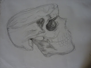
Perhaps I need to use a different picture for my header to that of the skull sketch I'm currently sporting. . .which puts me in mind of Hamlet. . . to be or what to be. . . that is the question. . .
Wednesday, 27 October 2010
Retrospective: landscape and nature
Most of these were hastily sketched on a recent trip to Loch Awe. I had very little in the way of materials, as I forgot to take them! No charcoals, pastels, paints, which for such an expansive subject would have been useful. Still it was a good exercise in trying to capture an enormous view and a richly textured subject in a simplified way with just a pen, and a few cheap kids colouring pencils. The watercolour is not from that trip, but from years ago, and shows the result of me trying to get to grips with watercolours, working out what they do on the page, not very well I fear, they seem really hard!
Retrospective : portraits
Some of these look so 80s they are probably quite fashionable now!
With the 80s revival and all. Retro-spective indeed! My favourite mediums when I drew them were pastels and charcoal as they are quick to work with and I feel don't require painstaking accuracy, you can blend them and they are expressive. The orange and black one was an attempt at "graphic" type art and a rare gouache. How's that for 80's revival fashion! Puts me in mind of Kylie's video for Can't Get You Outta my Head.
There are a few self-portraits, not particularly through introspection and self obsession (although I was very young at the time!), but through the lack of being unable to find enough people who would sit still for long enough for me to draw! You probably won't be able to spot the self portraits as I am quite different looking now (older and fatter) and also the drawings themselves actually look like different people anyway! There is another break from the norm, in the acrylic painting, another self portrait though you wouldn't know it.
Subscribe to:
Posts (Atom)